apt4Maths: Set of 14 PowerPoint Presentations (Relating to Statistics) on Collecting and Presenting Data for GCSE (and Key Stage 3) Mathematics


From £34.00 ex VAT
If you are a school/college and would like to place an order and be INVOICED later, please email sales@apt-initiatives.com.
This set of 14 PowerPoint Presentations, written by a highly experienced teacher (of 25+ years), senior examiner and reviser for Maths and Stats examinations, are designed for use by:
- any teacher – not necessarily a maths specialist – as part of their own delivery of lessons.
- students working independently.
They can be used by:
- cover teachers.
- students who are unable to attend their lesson in person.
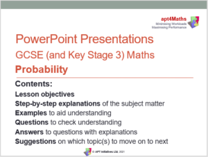
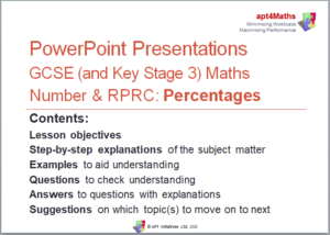
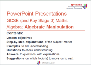
Each PowerPoint Presentation includes:
- Lesson objectives
- Step-by-step explanations of the subject matter
- Examples to aid understanding
- Questions to check understanding
- Answers to questions, with explanations
- Suggestions regarding which topic(s) should be moved on to next.
Product Information
This set of 14 PowerPoint Presentations (299 slides, excluding Title Pages) covers the following ‘collecting and presenting data’ based topics:
- 01 Types of Data (24 slides): Explains the different types of data and how data can be classified according to who collected it.
- 02 Collecting Data (31 slides): Reviews the data handling cycle and explains the main methods of collecting data and how to avoid bias, as well as how to record and clean data.
- 03 Questionnaires and Surveys (30 slides): Explains the dos and don’ts when designing questionnaires or surveys, reviews grouping data, explains random response techniques and what to do with unexpected responses.
- 04 Sampling and Bias (25 slides): Defines key statistical terms, outlines how to avoid bias, and explains the main methods of sampling.
- 05 Block Diagrams and Dot Blocks (12 slides): Explains how to draw, read and interpret block diagrams and dot plots.
- 06 Pictograms (16 slides): Explains how to draw, read and interpret pictograms; highlights how pictograms are suitable charts for representing qualitative data.
- 07 Bar Charts, Bar Line Graphs and Frequency Diagrams – Polygons (26 slides): Explains how to produce, read and interpret a variety of bar charts and vertical line graphs, as well as frequency diagrams and polygons.
- 08 Line Graphs (9 slides): Explains how to plot / draw, read off and interpret simple line graphs.
- 09 Stepped Tables and Two-way Tables (18 slides): Explains how to use stepped tables and how to complete, read and interpret two-way tables.
- 10 Pie Charts (18 slides): Explains how to draw and interpret pie charts.
- 11 Scatter Diagrams (40 slides): Explains how to plot a scatter diagram, explains correlation – types and strength, how to draw and use lines of best fit, and how to find and interpret the equation of the linear regression line.
- 12 Stem and Leaf Diagrams (17 slides): Explains how to produce stem and leaf diagrams, including back-to-back stem and leaf diagrams.
- 13 Histograms (14 slides): Explains how to produce and interpret histograms.
- 14 Misleading Graphs and other Data Representations (19 slides): Explains how diagrams, charts and graphs might be misleading.
Note:
- Work on frequency tables, cumulative frequency tables and graphs, box (and whisker) plots and time series is included in APT’s set of PowerPoints on ‘Analysing Data’.
- Work on conversion graphs and distance-time graphs is included in APT’s set of PowerPoints on ‘Graphs’.
- There are also additional PowerPoints available that cover the additional GCSE Statistics parts of this module of statistical work – covering sampling in more depth, comparative pie charts, population pyramids and choropleths.
Download Sample Material
apt4Maths PowerPoint on Collecting and Presenting Data - Line Graphs
Related products
-
apt4Stats: Set of 14 PowerPoint Presentations on Analysing Data for GCSE Statistics
 From £29.50 ex VAT
-
apt4Maths: Set of 6 PowerPoint Presentations on Probability for GCSE (and Key Stage 3) Mathematics
 From £10.00 ex VAT
-
apt4Maths: Set of 7 PowerPoint Presentations (Relating to Number AND Ratio, Proportion and Rates of Change) on Percentages for GCSE (and Key Stage 3) Mathematics
 From £10.50 ex VAT
-
apt4Maths: Set of 8 PowerPoint Presentations (Relating to Algebra) on Algebraic Manipulation for GCSE (and Key Stage 3) Mathematics
 From £15.50 ex VAT