apt4Stats: Set of 14 PowerPoint Presentations on Analysing Data for GCSE Statistics


From £29.50 ex VAT
If you are a school/college and would like to place an order and be INVOICED later, please email sales@apt-initiatives.com.
This set of 14 PowerPoint Presentations, written by a highly experienced teacher (of 25+ years), senior examiner and reviser for Maths and Stats examinations, are designed for use by:
- any teacher – not necessarily a maths specialist – as part of their own delivery of lessons.
- students working independently.
They can be used by:
- cover teachers.
- students who are unable to attend their lesson in person.
Each PowerPoint Presentation includes:
- Lesson objectives
- Step-by-step explanations of the subject matter
- Examples to aid understanding
- Questions to check understanding
- Answers to questions, with explanations
- Suggestions regarding which topic(s) should be moved on to next.
Product Information
This set of 14 PowerPoint Presentations (238 slides excluding Title Pages) covers the following topics relating to ‘Analysing Data’:
- 01 Averages – Mode (19 slides): Reviews and interprets different types of data representations (charts, tables and graphs) before explaining what a modal average is and how to find the mode for qualitative or discrete data. It also explains how to find the modal class for grouped or continuous data.
- 02 Averages – Median (19 slides): Reviews and interprets different types of data representations before explaining what a median average is, how to find the median for discrete data, and how to find the median class for grouped or continuous data. It also explains how to calculate an estimate of the median for continuous data.
- 03 Averages – Mean (19 slides): Reviews and interprets different types of data representations before explaining what a mean average is, how to find the mean for discrete data, and how to calculate an estimate of the mean for grouped or continuous data.
- 04 Other Means – Weighted & Geometric(12 slides): Explains how to find the weighted and geometric means of data.
- 05 Measures of Dispersion – Range (16 slides): Reviews and interprets different types of data representations before explaining how to calculate the range for discrete data and how to calculate the maximum range for grouped or continuous data.
- 06 Measures of Dispersion – Interquartile Range (20 slides): Explains how to calculate the interquartile range for discrete data, and how to find the interquartile range from a cumulative frequency curve or polygon. It also explains how to estimate the interquartile range for continuous data.
- 07 Cumulative Frequency (25 slides): Explains how to produce and interpret a cumulative frequency table, how to draw and interpret cumulative frequency curves or polygons, and how to find quartiles, deciles and percentiles as well as the interpercentile range.
- 08 Box (and Whisker) Plots (11 slides): Explains how to produce and interpret a box (and whisper) plot, and explains distribution shapes and skewness, and how to compare distributions. It also explains how to determine ‘outlier’ values for box plots using the IQR.
- 09 Distributions, Variance & Standard Deviation (18 slides): Reviews and interprets different types of frequency distributions and explains how to calculate and use variance and standard deviation.
- 10 Skewness Coefficients (11 slides): Reviews shapes and properties of distributions and explains how to calculate and interpret the Quartile Coefficient of Skewness and Pearson’s Skewness Coefficient.
- 11 Time Series and Moving Averages (25 slides): Explains trends, seasonality and moving averages, how to calculate moving averages, and how to plot, use and interpret time series graphs. Explains how to calculate and use seasonal effect, and how to plot and interpret Z charts.
- 12 Crude and Standardised Rates (11 slides): Explains how to calculate crude and standardised rates for births, deaths, marriages, and unemployment data.
- 13 Index Numbers (22 slides): Explains how to calculate use and interpret index numbers, chain base index numbers and weighted index numbers. Gives real-life examples where weighted indices are used. Explains RPI, inflation, CPI and GDP, as well as how to interpret an output gap chart.
- 14 Quality Assurance (10 slides): Explains quality assurance, the graphs used to monitor quality assurance and how to interpret these with respect to warning and action limits.
These PowerPoints are one of 4 sets of PowerPoint Presentations that APT Initiatives Ltd has published to support teachers and students of GCSE Statistics. Other sets concern:
- Collecting Data
- Representing Data
- Probability
Download Sample Material
apt4Stats PowerPoint on Analysing Data - Box (and Whisker) Plots
Related products
-
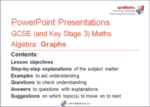
apt4Maths: Set of 11 PowerPoint Presentations (Relating to Algebra) on Graphs for GCSE (and Key Stage 3) Mathematics
 From £20.50 ex VAT
-
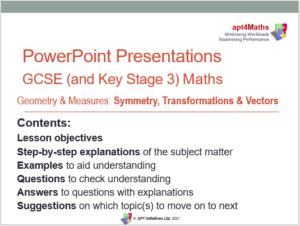
apt4Maths: Set of 10 PowerPoint Presentations (Relating to Geometry and Measures) on Symmetry Transformations and Vectors for GCSE (and Key Stage 3) Mathematics
 From £16.50 ex VAT
-
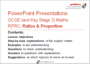
apt4Maths: Set of 8 PowerPoint Presentations on Ratios and Proportion for GCSE (and Key Stage 3) Mathematics
 From £11.00 ex VAT
-
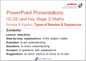
apt4Maths: Set of 10 PowerPoint Presentations (Relating to Number AND Algebra) on Types of Number and Sequences for GCSE (and Key Stage 3) Mathematics
 From £20.50 ex VAT